Want to add drop shadow effect to your website images or other content? It can be done using CSS, no need to use complicated software. The benefit of using CSS to add shadow effect is that you can target the elements precisely and modify them as and when needed. In the case of images, adding the drop-shadow effect via CSS eliminates the need to permanently modify them.
You can add the drop shadow effect using a simple CSS property called Box Shadow to almost any HTML element or image. Box Shadow is a simple CSS property that attaches one or more shadows to an element using offsets, blur, radius, and color. Box Shadow was introduced in CSS way back when and is support by all the modern browsers.
The best thing about Box Shadow is that you can either add shadow effect outside the content box or inside. Now, you might be wondering what in the world is a content box means. In simple terms, a content box is nothing but an HTML element like P, DIV, etc.
CSS Box Shadow Syntax
The syntax for Box-Shadow property will be something like this.
box-shadow: <horizantal-offset> <vertical-offset> <blur-radius> <spread-radius> <color>;
Horizontal offset (required value): This is a required value and when you set positive values (like 10px), the shadow will be pushed to the left side horizontally. A negative value (like -10px) will push the shadow to the right side. You can set it to 0 if you don’t want to offset the shadow.
Vertical offset(required value): This is a required value and when you set positive values (like 10px), the shadow will be pushed down vertically. Negative values (like -10px) will push the shadow up vertically. You can set it to 0 if you don’t want to offset the shadow.
Blur radius(required value): This value blurs the shadow so that it won’t have any hard edges. The higher you set the value, the higher will be the blur effect. If you don’t want the blur effect, you can set it to “0”.
Spread radius (options value): This is an optional value that spreads the shadow depending on the value you set. The higher the value, the higher the spread will be. If you don’t want the spread effect, you can either omit the value or set it to “0”.
Color (required value): You can set any color you want using hex, RGB (Red, Blue, Green, Alpha), HLSA(Hue, Saturation, Lightness, Alpha), and named HTML colors. If you didn’t set any color, the browser will set a default color. The default color is entirely dependent on the browser you are using. So, it is always a good idea to set the color.
Add CSS Box Shadow to an Image or Content Box
Using the above syntax, you can add the drop-shadow effect to any element with ease. For instance, if you want to add the shadow effect with both blur and spread to a div element then all you have to do is target that element using the element tag or its CSS class or ID and fill in the values of the box-shadow property. It will look something like this.
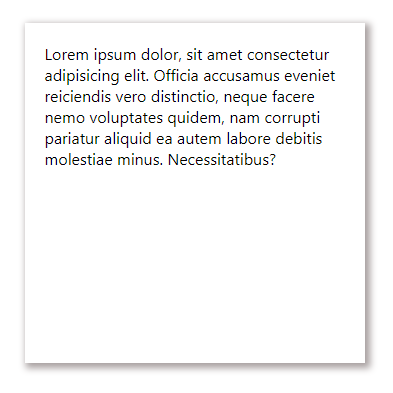
.shadow-effect {
box-shadow: 3px 3px 10px 2px #a9a1a1;
}
Result:
If you don’t want to blur the shadow but want to spread it out, the code will look something like this.
.shadow-effect {
box-shadow: 5px 5px 0px 2px #a9a1a1;
}
As you can see, I’ve set the blur radius to 0px. The resulting shadow effect has hard edges and looks something like this.
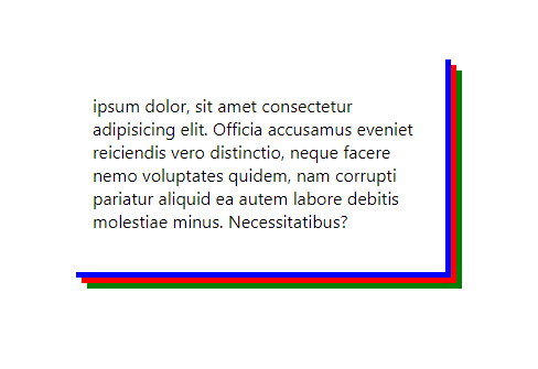
One of the craziest things about Box-Shadow property is that it allows you to add multiple shadows. To do that, all you have to do is specify comma separated values. The syntax will look something like this.
.shadow-effect {
box-shadow: 10px 10px 0 blue, 15px 15px 0 red, 20px 20px 0 green;
} 
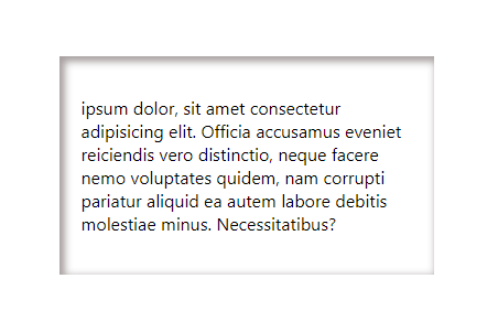
By adding “inset” to box-shadow property, you can show the shadow effect inside the content box.
.shadow-effect {
box-shadow: inset 3px 3px 10px 2px #a9a1a1;
}
Result:
These are just a few examples of how you can add the shadow effect to any content box or image. By simply modifying different values, you can get the shadow effect you want. Just play around and see what fits your needs.
CSS Text Shadow Generator
If you want to add the drop shadow to text then you have to use the Text-Shadow property. The syntax is very similar to Box-Shadow property but there is no spread radius in the Text-Shadow property. Here’s the syntax.
text-shadow: <horizantal-offset> <vertical-offset> <blur-radius> <color>;
When you replace the above syntax with actual values, it will look something like this.
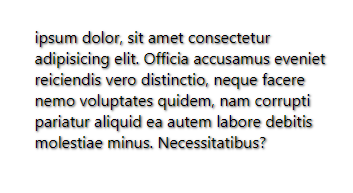
p {
text-shadow: 1px 1px 2px #333333;
}
The resulting effect will be something like this.
Unlike the box-shadow property, the blur value in Text-Shadow is optional. i.e, if you don’t want the text shadow to be blurry, you can either omit the value or set it to “0”.
Add CSS Box Shadow on Specific Images on Wordpress
Now, that we have figure out, how to add a shadow effect to images using CSS, we now need a way to make add it on specific images without impacting other images on the website.
To do so, you can simply create a new CSS class and add it to the image as and when needed. This way, only images with that specific CSS class will have the shadow effect.
To create a new CSS class, you can either use Simple Custom CSS Wordpress plugin or most WP themes also come with a custom.css file. You can add the CSS code in that file too.
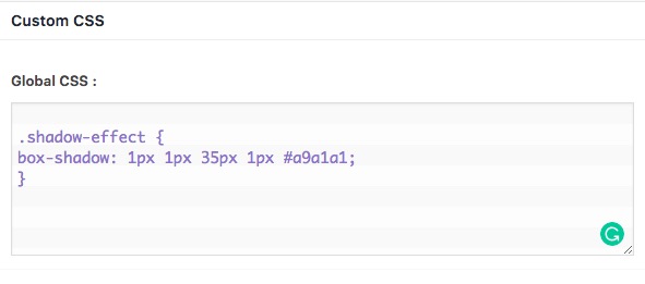
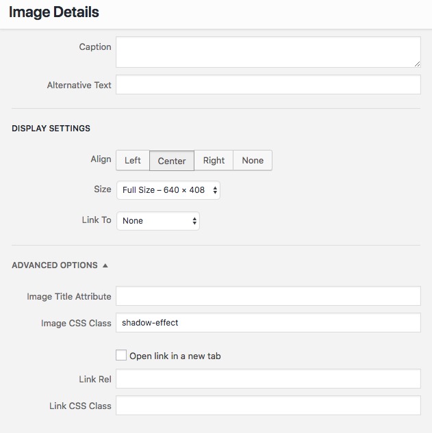
Next, double-click on the Edit icon for that image (the one that looks like a pencil). Under the Advanced option look for Image CSS Class and type in the class name, you have defined in our stylesheet. For this instance, our class name is shadow-effect, once done save changes.
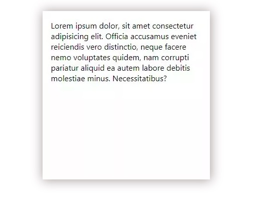
And then click “Save Draft” or ‘Update‘ to update the WordPress page. When the page is refreshed, the result looks like this:
Only the images with CSS Class shadow-effect, will have Box Shadow around it. If your blog post has 20, images, you will have to do it manually for 20 images, which is a bit tedious. However, it will still save you a lot of time from editing it on Photoshop.
As you can see, adding the drop-shadow effect using CSS is nothing hard. The examples I’ve shown here are just the basics. Just play with different values and you will see how effective both the Box-Shadow and Text-Shadow properties really are. For ease of use, you can use a box-shadow generator too.
Hope that helps. Comment below sharing your thoughts and experiences about using the above method to add drop shadow effect to images or content boxes using CSS.