The whole world is tracking the CoronaVirus every second. Apple even went ahead and made a self-screening tool to effectively diagnose the symptoms. I found a Siri Shortcut that plots a graph of Corona Virus growth for any country and can help you visualize the effects of the Corona Virus. Let’s see how.
Plot a Corona Virus Graph with Siri Shortcuts
The Shortcut uses an API made by Github user pomber to provide the growth chart of the current outbreak for the period of the last 30 days. The data is then plotted to a graph with the help of a third-party app, Charty.
Install the shortcut to your iPhone or iPad using this link. You’d also need to install Charty on your iPhone to make it work. As of writing this article, Charty is in beta but you can sign up for it and the dev approves the request in hours. I’ll update the App Store link when the app launches.
After installing both of these apps, simply tap the shortcut to run. It’ll prompt you to choose a parameter. You can draw a chart for confirmed cases, confirmed deaths, and the total recovered. Unfortunately, you can not draw a chart with multiple parameters.

The shortcut can generate a chart in both real value and the logarithmic equivalent. I chose the real value for easier interpretation. After that, choose the region and tap Done. The shortcut can plot a graph for every country that has been affected by the outbreak.

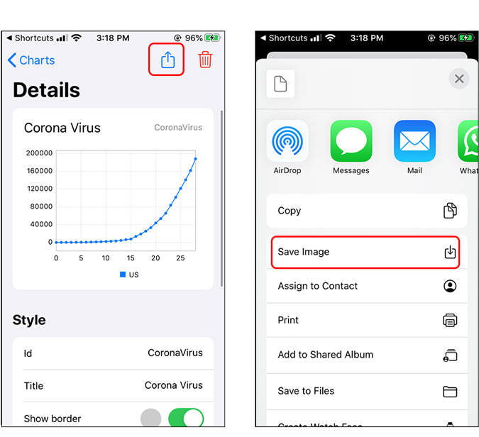
The shortcut will generate a chart in the app, Charty. You can even save the chart to Camera Roll by tapping the Share button.

Charty is still in the beta version so naturally, it has some bugs. For example, the app sometimes crashes when you save the image to the Camera Roll. Hopefully, the issues will be fixed when the app launches on the App Store. Let me know if you face any problems with this method.