Phubbing (phone snubbing) is when your partner spends more time on their phone in your presence. And according to recent studies, the people who experience the most phubbing in their relationships also tend to have more conflict.
Now, one way to get rid of this smartphone addiction is to buy feature phones, but what if I tell you, you can also use third-party app launchers to get similar results. Enter Minimal launchers, they change the way you view your phone, revamp your UI, and control your on-screen time. In this article, I’ve handpicked some of the best minimal launchers to get rid of smartphone addiction aka phubbing. Let’s check them out.
Best Minimal Launchers for Android
1. Indistractable Launcher
Indistractable Launcher takes inspiration from the LightPhone. That’s the first thing you see as soon as you unlock the phone is a minimal interface. The interface is black with the white text that brings out the contrast. The home screen comprises of time, date and battery percentage.

It can perform basic functions right from the home scene, it has a dialer from where you can access the dial pad, the call logs, and contacts.
Tasks is an in-built task manager which in my opinion is simple and can act as an everyday to-do list. You can individually check each item or simply clear all. There is no maximum limit to the To-do list, it adds a subtle scroll option when you move past the number of events the display can accommodate.
There are two main pages in the launcher, home page and the all applications page which you access by swiping from right to left. That’ll give you a list of all the installed apps in one place. You can further tap the application and add it to your favourites which will place a text on the home screen. You can also see the app info and uninstall from the app menu.
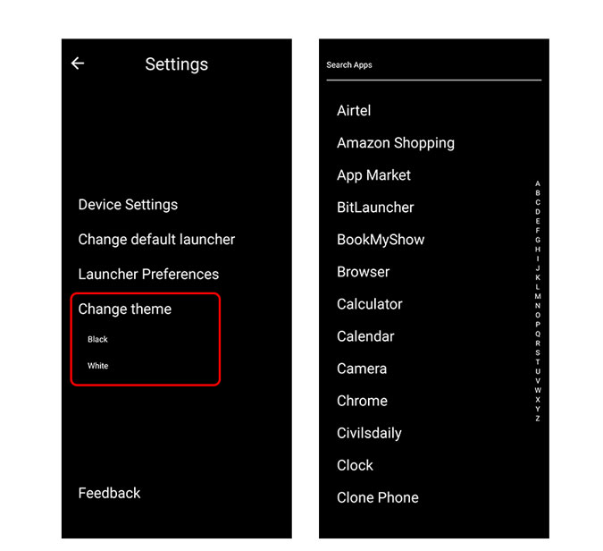
A small setting icon is placed on the home screen which takes to a different page. You can access your device settings, change the default launcher in case you’re bored and change the theme. Currently, there are two themes you can choose from, black and white. There is a different section for launcher preference as well where you can hide or show app icon against the text in the app menu. You can also hide the status bar (System), hide the battery level and change the time format. Unfortunately, there is no option to hide apps from the apps list.
Overall, Indistractable is one of the few minimal launchers I stumbled upon, used and didn’t uninstall.
What to look out for
- Minimal launcher
- Black and White contrasting Themes
- List of all apps
- Built-in Task Manager
Get Indistractable Launcher here.
2. LessPhone
The only launcher in the list that is recommended by Unbox Therapy. With a tag line,’ A Restraining Order from Your Phone’, LessPhone delivers just that. It looks and feels a lot similar to Indistractable launcher but there are few minor differences.
To start with the basics it has a digital clock on the top while the battery percentage is on the top right. LessPhone also has a task manager as the previous one. The dialer can be accessed from the bottom left.

Though the approach is the same as the previous launcher, LessPhone works on Assigning important and frequently visited apps in the “Custom App” rack that is displayed on the Home Screen. So you have an option to choose from 3 apps that’ll be displayed beneath tasks on the home screen.
You can change the settings from the bottom right of the home screen. Here you can switch to dark mode and increase the number of custom apps (paid) that are displayed on the home screen.

Then there are system setting and launcher settings where you can change your preferred launcher and also change the default apps for browser, phone, and messages.
What to look out for
- Can’t access all apps menu
- In-app purchase to increase Favorite apps (INR 140)
3. Boring Phone
This is the third one with the same UI approach but this one is a bit more customizable. Though I won’t say the home screen is minimal it still is less congested than our native home launchers.
One of the few common features is the task manager wherein you can display the to-dos of the day.
What’s different?
Well, it wants you to select apps that’ll be displayed at the bottom of the home screen. You can put a maximum of 8 icons which you use frequently. So essentially it wants to restrict you using these apps which are most necessary according to you. There is no way to access all apps, so until you’re too sure of the 4-8 apps, be ready to keep modifying these.
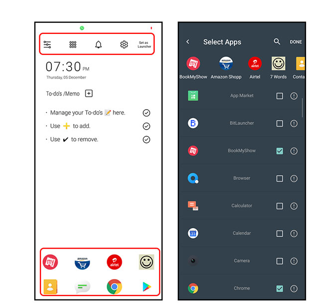
Android already lets you tweak and restrict notification but you have to access it through settings. Here it’s there on the top with a bell icon so you can straightway modify notifications. There’s a system setting on the top as well with the app menu for home screen apps selection.
Customization
You have far more options in terms of customization when compared to Inditractable or LessPhone however they come at a cost. There is an app section that lets you show app titles and toggle between 4 and 8 icons on the home screen. You can also hide icons and select icon size.

In terms of premium features (paid), you can choose custom themes including neon based colors, in addition to that, you can select a different color for the background as well. Another premium feature is using a 24-time format and seconds preview, which I feel should’ve been free in the first place.
Usage Statics Chart/ Usage Statics List
There are separate apps to show your app usage but this launcher has it built-in. It makes sense in terms of being a whole package. It has two modes Usage Statics Chart which gives you a pie chart of the most used apps and a list which tells you when was the last used and how much since that time.
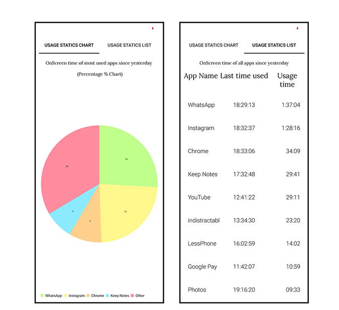
It’ll give you an idea of important apps and where you’re wasting your time so you can keep or remove them.
What to look out for
- Tempo Notification Restriction
- App Usage Statistics
- Customizable
4. Ap15 Launcher
Consider this a home screen replacement. It gives you all the apps as texts on the home screen. It gives emphasis on the apps that you open the most and highlights them by making the text bigger. As all the apps are there on the home screen, you have the option to access them, unlike the ones we discussed before this, which restricts you to certain apps.
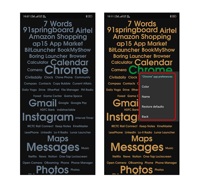
There are no distinct setting features as it’s based on using texts for the interface, but you can customize the text. When you press and hold on the app text, it opens a drawer from where you can uninstall, hide and access Pro features. In terms of customization, you can change the colour, name of the app text, and restore it to default in case you want to revert to new.

There is also app reference which you can access by tapping and holding any app, which lets you change the UI of the home screen. You can change the colour, size, and even font style. It also lets you choose the notification colour so when you receive a notification the text colour changes. You can set a custom photo for the home screen or select from the colour palette.
Common App rules are:
- 30% most used with larger text size (Default)
- 30% most used at the top
- Custom rules can be created and saved
What to look out for
- Choose Background Patterns
- Allows creating custom background images
- In-app purchases (INR 160)
5. Siempo
Everything successful starts with good intention and such are Siempo.
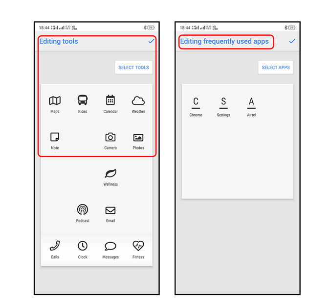
It’s basically divided into four scroll-able screens, with the first one being Intentions. You can set a phrase you want to focus on when you open the screen. The fourth is flagged apps, which you want to avoid using. Your intention is shown on the top to remind you, your intention.

The second screen is Tool Kit( Necessary apps) sort of a screen where you can select default apps. For example an app for camera or fitness, where you can select the app that is closest to what you use. The third screen is Frequently used apps that you use the most like What’s app, Reddit etc.
Extra Feature
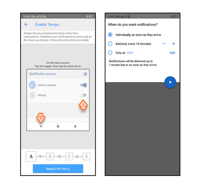
Tempo. You get a notification in realtime, with Tempo you can batch all of the notifications together and select a custom time when you want to view them all.
What to look out for
- Tempo, the Notification feature
- Dark Mode
- Section for most used and apps to avoid
6. Bald Phone
Bald Phone is unlike anything on the list. The UI will remind you of the early smartphones with magnified icons and controls on the screen. If you’re thinking bigger will make the UI worse, it doesn’t. Rather you get a simpler home screen with a three-page layout. The first one is the home screen with big app icons along with the menu section. It also has a pill reminder and SOS button with one tap reach. This quick function bar remains on all the screens in case you need it in an emergency.
The app is not just minimal but requires a 2-second touch feedback every time you try to open any app making it great for senior citizens and users with motor problems
The second page has other major apps one uses, such as maps, browser, in-app settings such as theme, font size, custom app editor, etc. That’s not it, if you scroll to the third page, you can make use of a handy note-taking canvas which you can write on. In case you wish to recite something, you can enjoy using the text to speech feature as well.
The app is open source and comes free of cost.

What to look out for
- Large icons
- Pill Reminder
- Three homepages with text to speech note-taking
- Constant status bar with a flashlight, SOS icon, battery indicator, sound profile, etc.
Closing Words
Let’s talk about business. Launchers are a great way and we’ve been talking about them so much. They let you modify the already tweak-able Android experience. So which app to choose? Well, I personally use Indistractable because it’s minimal and it has an all apps viewing option. It does the job and checks all the boxes for a minimal launcher. Ap15 and Siempo are great too, but they look a bit cluttered to me. But if it’s a customization you’re looking for, these are the apps to go for.
Whatever it is that you choose, if it’s out of the ones I told you, you won’t be disappointed, that is for sure. Do leave a comment if you think I’ve missed something extraordinary.